
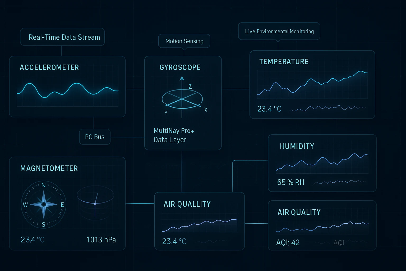
Sensor Data Visualization Tutorial: Build Real-Time IoT Dashboards with 7 Sensors
RFOXiA Integrated Sensors Module
The Complete Sensor Data Visualization Tutorial for Hardware Developers and IoT Builders
If you've ever deployed a sensor array and stared at a raw serial output wondering how to turn those numbers into something meaningful — this guide is for you. This sensor data visualization tutorial walks you through every layer of the process: from hardware selection and I2C wiring, to firmware data formatting, to rendering live dashboards that actually tell you something useful.
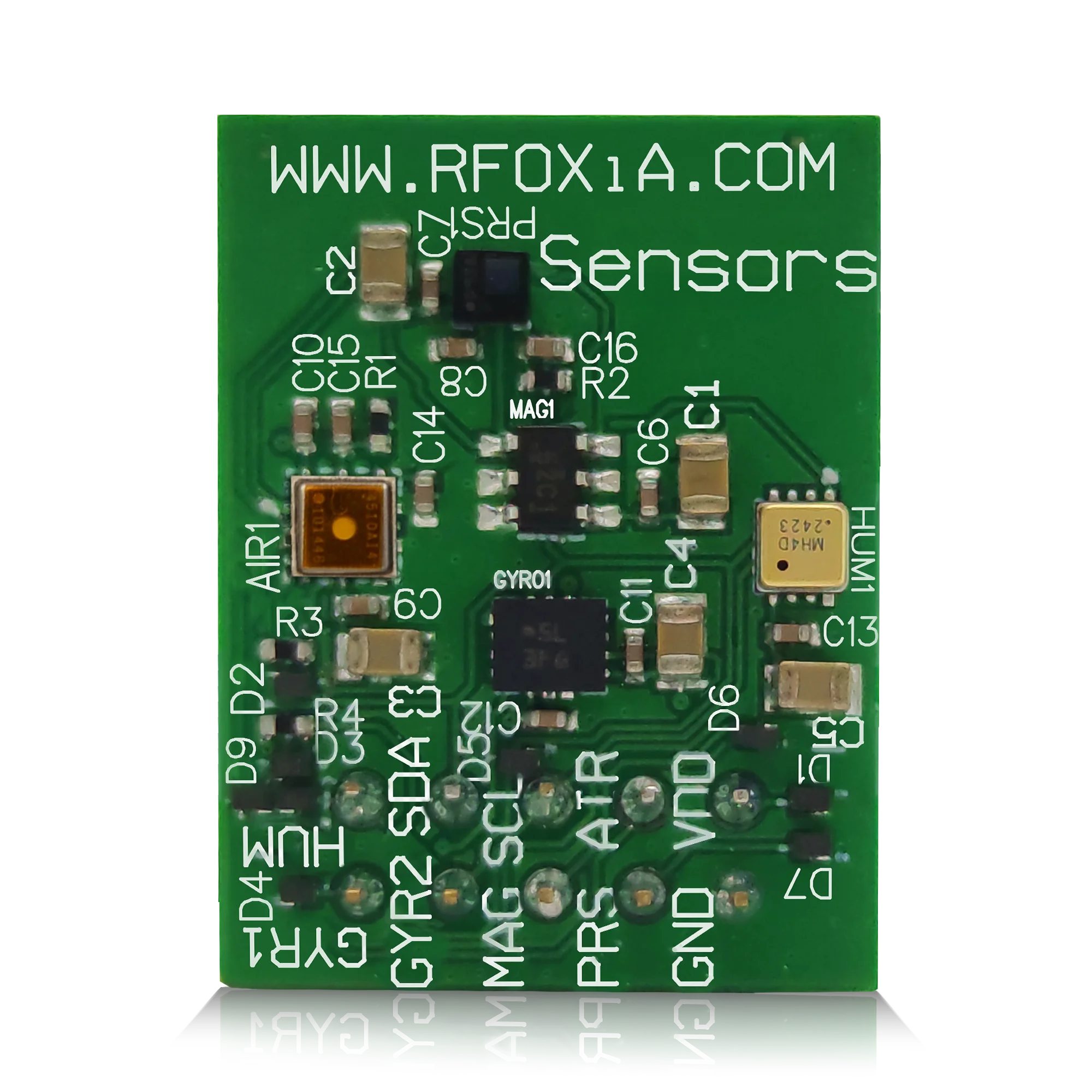
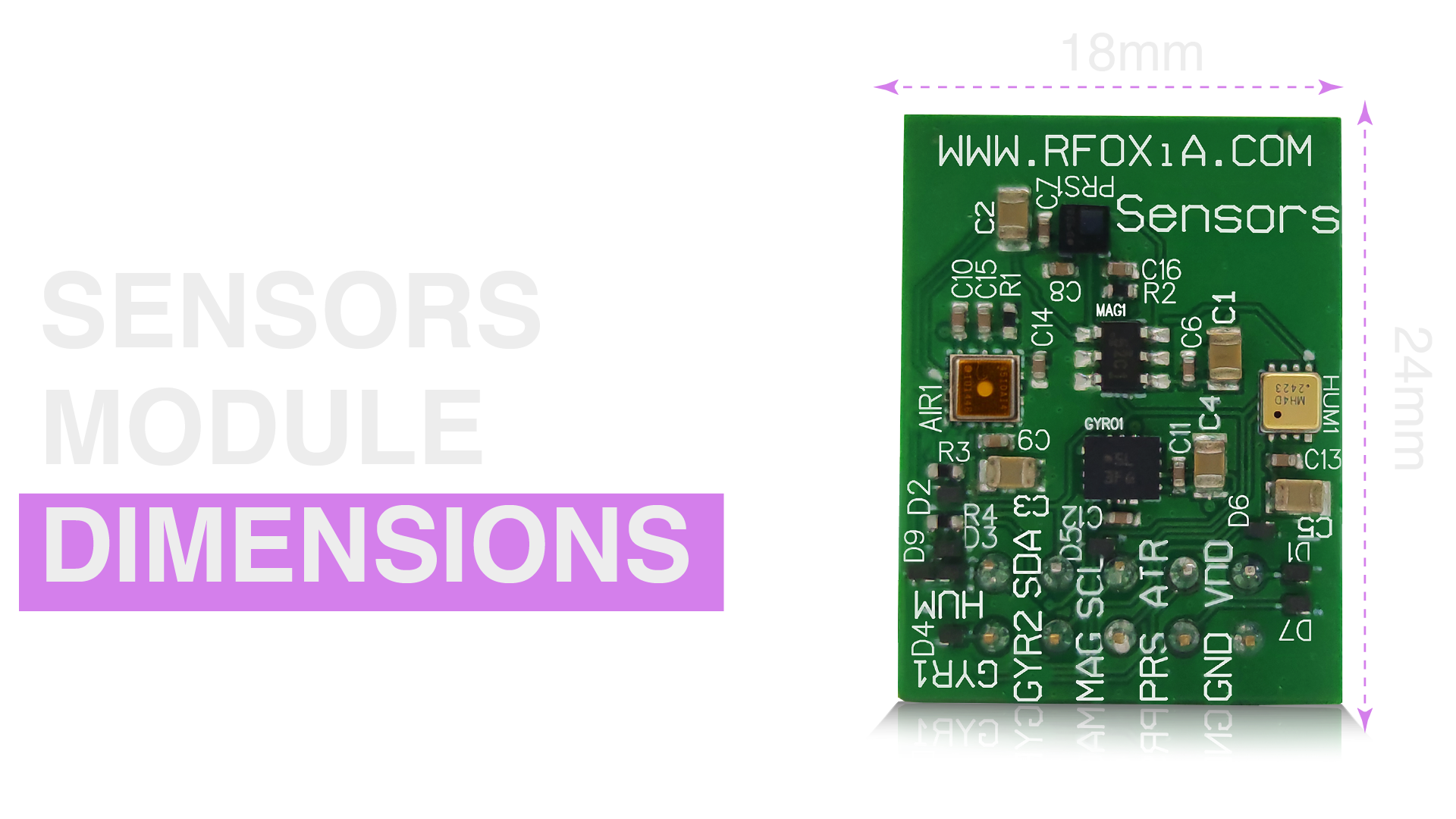
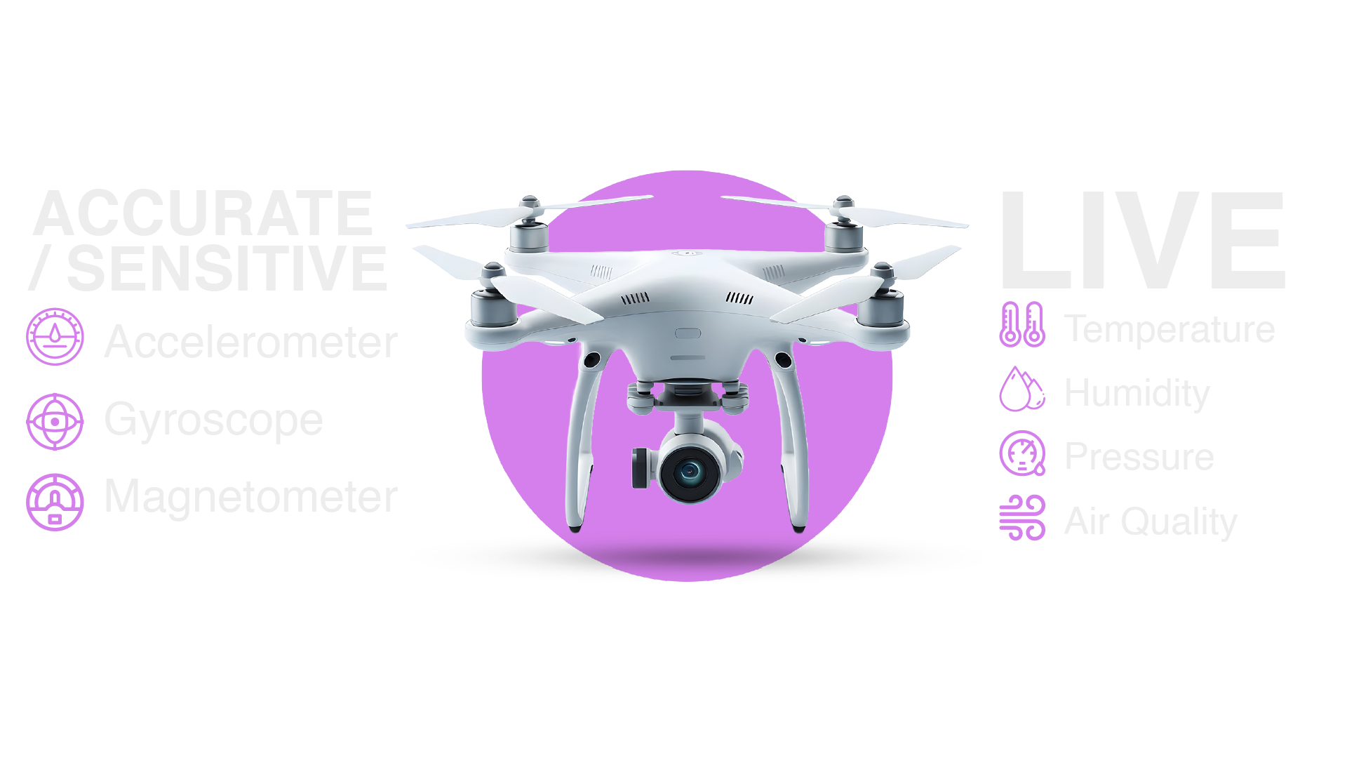
We'll use the MultiNav Pro+™ Sensors Module from RFOXiA as the hardware reference platform throughout this tutorial. It's a 24mm × 18mm board packing seven industrial-grade sensors — accelerometer, gyroscope, magnetometer, temperature, humidity, air pressure, and air quality — all communicating over a single I2C line. It's one of the most integration-dense sensor modules available to makers and professional developers at its price point ($39), and it's an ideal subject for a complete visualization project.
Let's get into it.
Why Sensor Data Visualization Matters
Raw numbers from a sensor mean very little on their own. A temperature reading of 34.2°C tells you something. A temperature trend line over six hours showing a steady climb from 28°C to 34°C with a matching rise in humidity and a corresponding dip in air pressure — that tells you a story. Visualization is the layer between data and understanding.
For drone operators, this means watching IMU data live during test flights to catch vibration signatures before they become failures. For environmental researchers, it means identifying microclimate anomalies that would be invisible in averaged or delayed data. For industrial IoT developers, it means building dashboards that operators can act on in real time — not reports they review the next morning.
The difference between useful sensor systems and useless ones is almost always the visualization layer. This tutorial gives you that layer.
Hardware Overview: The MultiNav Pro+™ Sensors Module
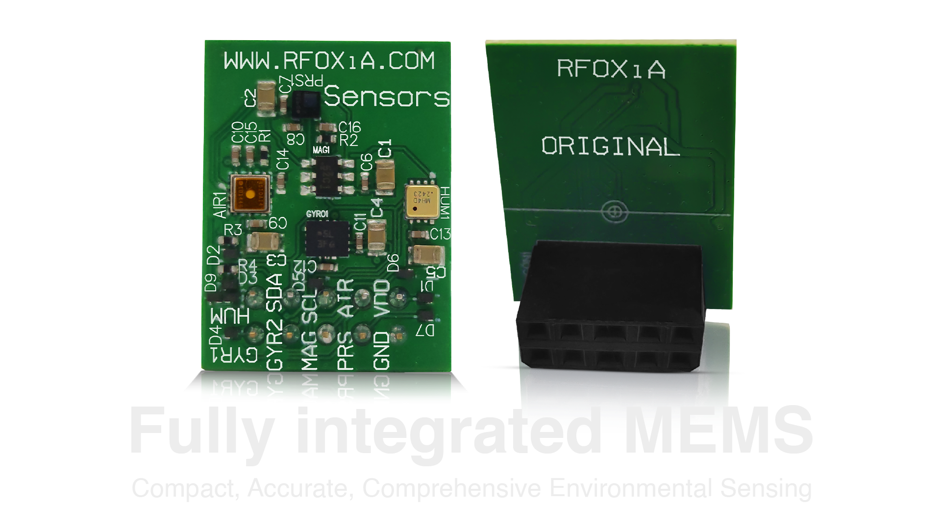
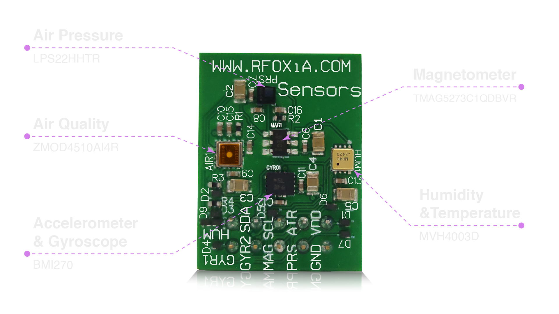
Before writing a single line of visualization code, you need to understand what you're working with. The MultiNav Pro+™ Sensors Module combines seven distinct sensors on a single compact PCB:
- Accelerometer & Gyroscope: BMI270 from Bosch Sensortec — a premium IMU used in professional drone and automotive applications
- Magnetometer: TMAG5273C1QDBVR from Texas Instruments — for heading and compass data
- Air Pressure: LPS22HHTR from STMicroelectronics — barometric pressure with altitude derivation capability
- Humidity & Temperature: MVH4003D from MEMSVision — fast-response environmental sensing
- Air Quality: ZMOD4510AI4R from RENESAS — O3 and NO2 sensing for outdoor air quality monitoring
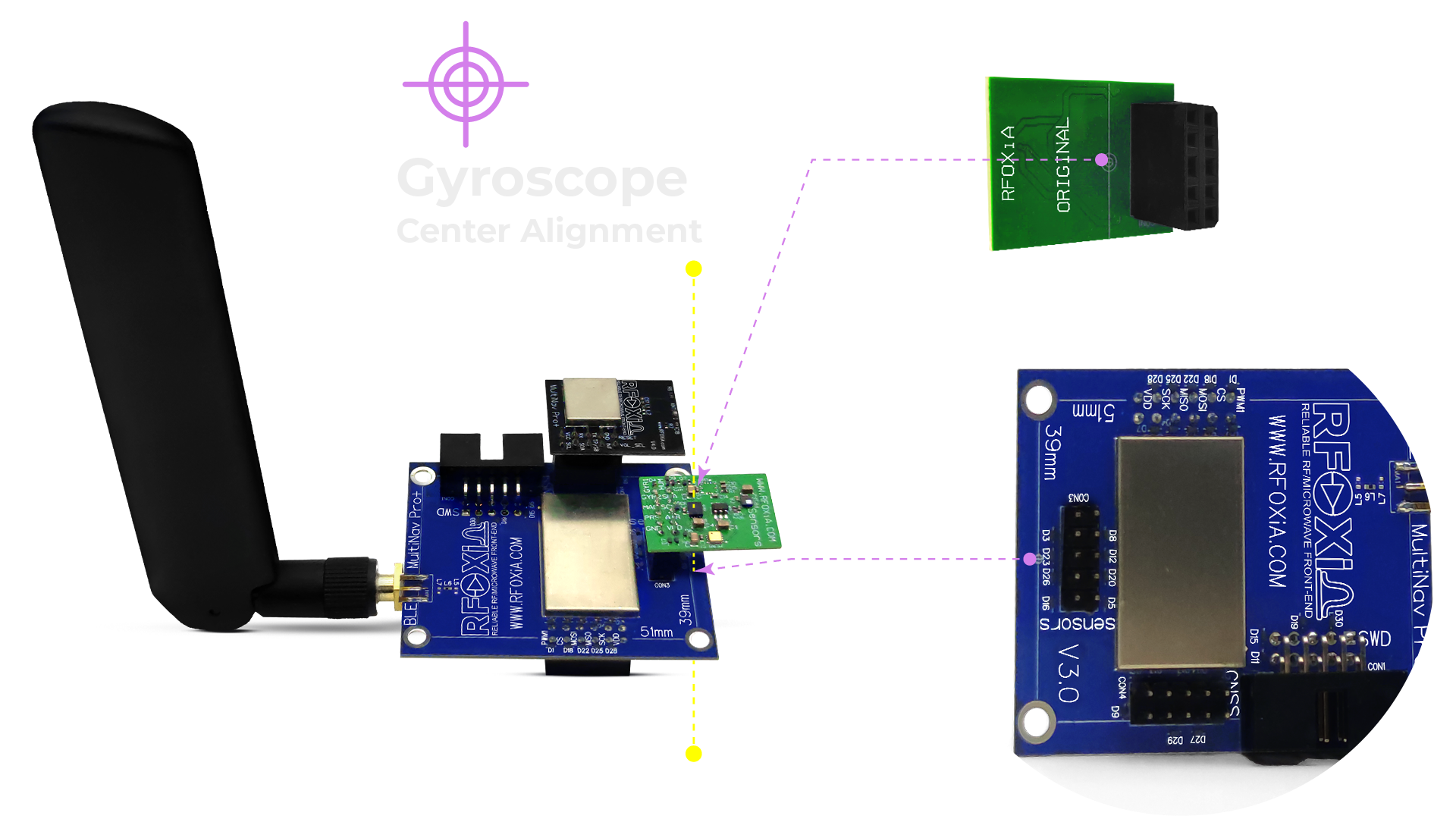
This combination is not accidental. Motion data (accelerometer, gyroscope, magnetometer) and environmental data (temperature, humidity, pressure, air quality) are often needed together — particularly in drone systems where you need to correlate flight dynamics with atmospheric conditions, or in environmental monitoring deployments where knowing orientation matters for sensor accuracy.
Having all seven sensors on one board simplifies your wiring dramatically, reduces your BOM complexity, and keeps your form factor tight — which matters enormously when you're mounting hardware on a drone frame or fitting it into an enclosure.
You can pick up the module and get started here: RFOXiA Integrated Sensors Module
Step 1: I2C Wiring and Bus Configuration
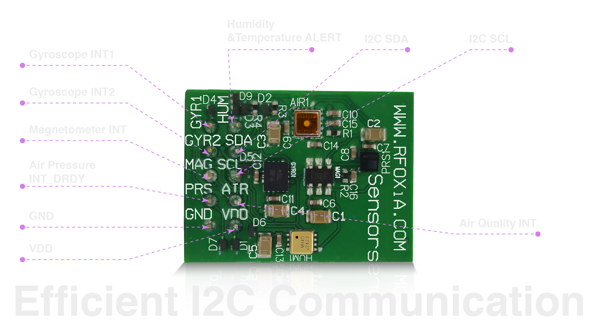
One of the most important design decisions RFOXiA made with this module is the I2C architecture. All seven sensors share a single I2C bus, each with a dedicated I2C address. This means you only need four wires from your microcontroller to the module: VCC, GND, SDA, and SCL.
Why This Matters for Visualization
In visualization-heavy applications, you're typically polling multiple sensors in a tight loop and streaming the results to a dashboard. Every time you add a sensor bus or require separate SPI connections, you add latency, firmware complexity, and failure points. A unified I2C bus with dedicated addresses means:
- One initialization sequence — set up the bus once, address each sensor individually
- No bus contention — dedicated addresses eliminate collisions without arbitration overhead
- Clean polling loop — read all seven sensors sequentially in microseconds
- Simple debugging — one bus to monitor with a logic analyzer or I2C sniffer
Wiring to Common Microcontrollers
For STM32-based systems (the native ecosystem for RFOXiA hardware):
SDA → PB7 (or I2C1_SDA on your specific variant)
SCL → PB6 (or I2C1_SCL on your specific variant)
VCC → 3.3V
GND → GND
For Arduino-compatible boards:
SDA → A4 (Uno) or Pin 20 (Mega)
SCL → A5 (Uno) or Pin 21 (Mega)
VCC → 3.3V
GND → GND
For Raspberry Pi:
SDA → GPIO2 (Pin 3)
SCL → GPIO3 (Pin 5)
VCC → 3.3V (Pin 1)
GND → Pin 6
Important: Use 3.3V logic. All sensors on this module are 3.3V devices. 5V logic levels will damage them.
Step 2: Firmware Data Formatting for Visualization
Visualization tools need data in predictable, structured formats. The most common choices for real-time IoT dashboards are JSON over serial/UART, MQTT with JSON payloads, or binary frames with a custom parser. For this tutorial, we'll use JSON over serial for local visualization and MQTT for networked dashboard applications.
JSON Serial Output Format
Structure your firmware output like this:
{
  "ts": 1714500000123,
  "accel": {"x": 0.021, "y": -0.003, "z": 9.812},
  "gyro": {"x": 0.12, "y": -0.08, "z": 0.03},
  "mag": {"x": 24.1, "y": -12.3, "z": 44.7},
  "temp": 23.4,
  "humidity": 61.2,
  "pressure": 1013.25,
  "aqi": {"o3": 0.031, "no2": 0.012}
}
Include a Unix timestamp (ts) in milliseconds. This is the anchor for every time-series chart you'll build. Without consistent timestamps, your visualization will have gaps, jumps, and artifacts that make the data useless.
Polling Rate Considerations
The BMI270 IMU supports output data rates up to 6400Hz. For visualization purposes, you rarely need more than 100Hz for motion data — and most dashboard rendering engines can't display faster than 60Hz anyway. Recommended polling rates:
- Accelerometer / Gyroscope: 100Hz (motion analysis), 10Hz (general logging)
- Magnetometer: 10Hz (heading is slow-changing)
- Pressure / Temperature / Humidity: 1Hz (environmental data changes slowly)
- Air Quality: 1Hz or slower (ZMOD4510 has its own internal processing cycle)
This tiered approach reduces your I2C bus load and gives your visualization layer time to render without dropping frames.
Step 3: Choosing Your Visualization Stack
This is where most tutorials lose people — there are dozens of options and no single right answer. Here's a practical breakdown based on your deployment context.
Option A: Grafana + InfluxDB (Best for Production Deployments)
Grafana is the industry standard for time-series visualization. It's open source, powerful, and has direct support for InfluxDB, which is purpose-built for sensor time-series data.
Setup flow:
- Install InfluxDB locally or use InfluxDB Cloud (free tier)
- Install Grafana locally or use Grafana Cloud (free tier)
- Write firmware to publish data via MQTT
- Use Telegraf as the MQTT → InfluxDB bridge
- Connect Grafana to InfluxDB as a data source
- Build dashboards with Grafana's panel editor
Best for: Multi-sensor long-term logging, environmental monitoring deployments, any project where you need historical querying and alerting.
Option B: Node-RED + Dashboard (Best for Rapid Prototyping)
Node-RED is a flow-based programming tool that excels at wiring together data sources and visualization outputs with minimal code. The node-red-dashboard package adds real-time charts, gauges, and maps with drag-and-drop simplicity.
Setup flow:
- Install Node-RED (npm or Docker)
- Install node-red-dashboard:
npm install node-red-dashboard - Use a serial-in or MQTT-in node to receive your sensor JSON
- Parse the JSON with a Function node
- Route values to chart, gauge, or text nodes
- Access your dashboard at
http://localhost:1880/ui
Best for: Rapid prototyping, quick demos, projects where you need a working dashboard in under an hour.
Option C: Python + Plotly Dash (Best for Custom Analytics)
If you need custom logic — anomaly detection, data fusion, derived metrics like altitude from pressure — Python with Plotly Dash gives you the full power of the Python data stack.
import dash
from dash import dcc, html
from dash.dependencies import Input, Output
import plotly.graph_objs as go
import serial
import json
from collections import deque

app = dash.Dash(__name__)
MAX_POINTS = 200

times = deque(maxlen=MAX_POINTS)
temps = deque(maxlen=MAX_POINTS)
pressures = deque(maxlen=MAX_POINTS)
humidity = deque(maxlen=MAX_POINTS)

app.layout = html.Div([
    dcc.Graph(id='env-chart'),
    dcc.Interval(id='interval', interval=1000, n_intervals=0)
])

@app.callback(Output('env-chart', 'figure'), Input('interval', 'n_intervals'))
def update_chart(n):
    # Read from serial here
    fig = go.Figure()
    fig.add_trace(go.Scatter(x=list(times), y=list(temps), name='Temperature (°C)'))
    fig.add_trace(go.Scatter(x=list(times), y=list(pressures), name='Pressure (hPa)'))
    return fig

if __name__ == '__main__':
    app.run_server(debug=True)
Best for: Research applications, data science workflows, projects needing derived calculations or ML integration.
Step 4: Building Your Real-Time Dashboard
Regardless of which visualization stack you choose, a well-designed sensor dashboard follows consistent layout principles. Here's how to structure a MultiNav Pro+™ dashboard for maximum usefulness:
Panel 1: IMU Data — 3-Axis Time Series
Show accelerometer X, Y, Z on a single chart with separate colored traces. Add gyroscope data on a second chart below. These panels update at your highest polling rate (50-100Hz for motion analysis). Use a rolling 10-second window for real-time display.
Key visual: Color code axes consistently across all motion panels. X = red, Y = green, Z = blue. This is a widely adopted convention that reduces cognitive load.
Panel 2: Compass Heading — Polar / Gauge
Magnetometer data is best shown as a compass rose or a simple heading gauge (0-360°). Derive heading from the X/Y magnetometer components:
import math
heading = math.degrees(math.atan2(mag_y, mag_x))
if heading < 0:
    heading += 360
Panel 3: Environmental Conditions — Multi-Metric Chart
Plot temperature, humidity, and pressure on a single chart using dual Y-axes (temperature and humidity share one axis in percentage/°C range, pressure uses a separate axis in hPa). This lets you visually correlate environmental changes across metrics.
Panel 4: Air Quality Index — Color-Coded Gauge
The ZMOD4510 provides O3 and NO2 concentrations. Map these to an AQI scale and display as a color-coded gauge (green → yellow → orange → red). This is far more immediately readable than raw ppb values for most users.
Panel 5: Altitude Derivation
Derive altitude from barometric pressure using the hypsometric formula:
altitude = 44330 * (1.0 - (pressure / sea_level_pressure) ** (1/5.255))
Display as a large single-value panel with trend arrow. Extremely useful for drone applications.
Step 5: Streaming Data to the RFOXiA Network
Here's where this sensor data visualization tutorial goes beyond a standard dev tutorial and into something genuinely different: you can monetize the data you're already collecting.
RFOXiA operates a live environmental data network. When you deploy a Sensors Module outdoors with GPS validation, your module streams verified environmental data — temperature, humidity, pressure, air quality, and GPS location — to RFOXiA's servers. RFOXiA aggregates this hyper-local, high-resolution data and sells it to enterprise buyers: agricultural technology companies, insurance risk modelers, smart city operators, logistics companies, and climate researchers.
You earn daily rewards for every verified complete data session. Base rates run $0.08–$0.25/day depending on location scarcity. Pioneer and founding member rates are higher and locked in. Nodes in data-sparse locations earn a scarcity bonus. Consistent uptime earns additional rewards.
This isn't a passive income gimmick — it's a genuine data marketplace. The value proposition to enterprise buyers is second-level temporal resolution and street-level geographic resolution. Most public weather APIs offer 1-minute or 10-minute averages from stations kilometers apart. Your module provides real-time data from exactly where you deployed it.
The practical implication: the dashboard you build in this tutorial doesn't just serve your project — it can serve the network. Your visualization confirms data quality. Your uptime earns rewards. The same hardware doing one job does two.
Step 6: Integrating with the RFOXiA Connect App
If you're building a drone or robotics application, the RFOXiA Connect mobile app adds a visualization layer you don't have to build yourself. The app displays live sensor data from the Sensors Module alongside GPS tracking and drone/robot control — all without requiring an internet connection.
This is particularly valuable during field testing. You get a live environmental dashboard on your phone, paired wirelessly via the BLE module, with no dependency on cellular coverage or Wi-Fi infrastructure. Take your system to a remote test site and your visualization layer comes with you.
Advanced Techniques: Sensor Fusion and Derived Metrics
Once your basic visualization is running, the next step is sensor fusion — combining data from multiple sensors to derive metrics that no single sensor can provide alone.
Tilt-Compensated Compass Heading
Raw magnetometer heading is only accurate when the module is level. Combine accelerometer tilt data with magnetometer readings to compute a tilt-compensated heading that remains accurate during motion:
roll = math.atan2(accel_y, accel_z)
pitch = math.atan2(-accel_x, math.sqrt(accel_y**2 + accel_z**2))

mag_x_comp = mag_x * math.cos(pitch) + mag_z * math.sin(pitch)
mag_y_comp = (mag_x * math.sin(roll) * math.sin(pitch) +
               mag_y * math.cos(roll) -
               mag_z * math.sin(roll) * math.cos(pitch))

tilt_heading = math.degrees(math.atan2(-mag_y_comp, mag_x_comp))
if tilt_heading < 0:
    tilt_heading += 360
Heat Index
Combine temperature and humidity to compute perceived temperature:
def heat_index(T, RH):
    HI = (-42.379 + 2.04901523*T + 10.14333127*RH
          - 0.22475541*T*RH - 0.00683783*T*T
          - 0.05481717*RH*RH + 0.00122874*T*T*RH
          + 0.00085282*T*RH*RH - 0.00000199*T*T*RH*RH)
    return HI
Vertical Velocity from IMU
Integrate Z-axis accelerometer data to derive vertical velocity — useful for drones and UAVs when GPS fix rate is insufficient for altitude hold:
dt = 0.01  # 100Hz polling
velocity_z += (accel_z - gravity_bias) * dt
Note: IMU integration drifts over time. Fuse with barometric altitude for drift correction in long-duration applications.
Applications: Who Needs This?
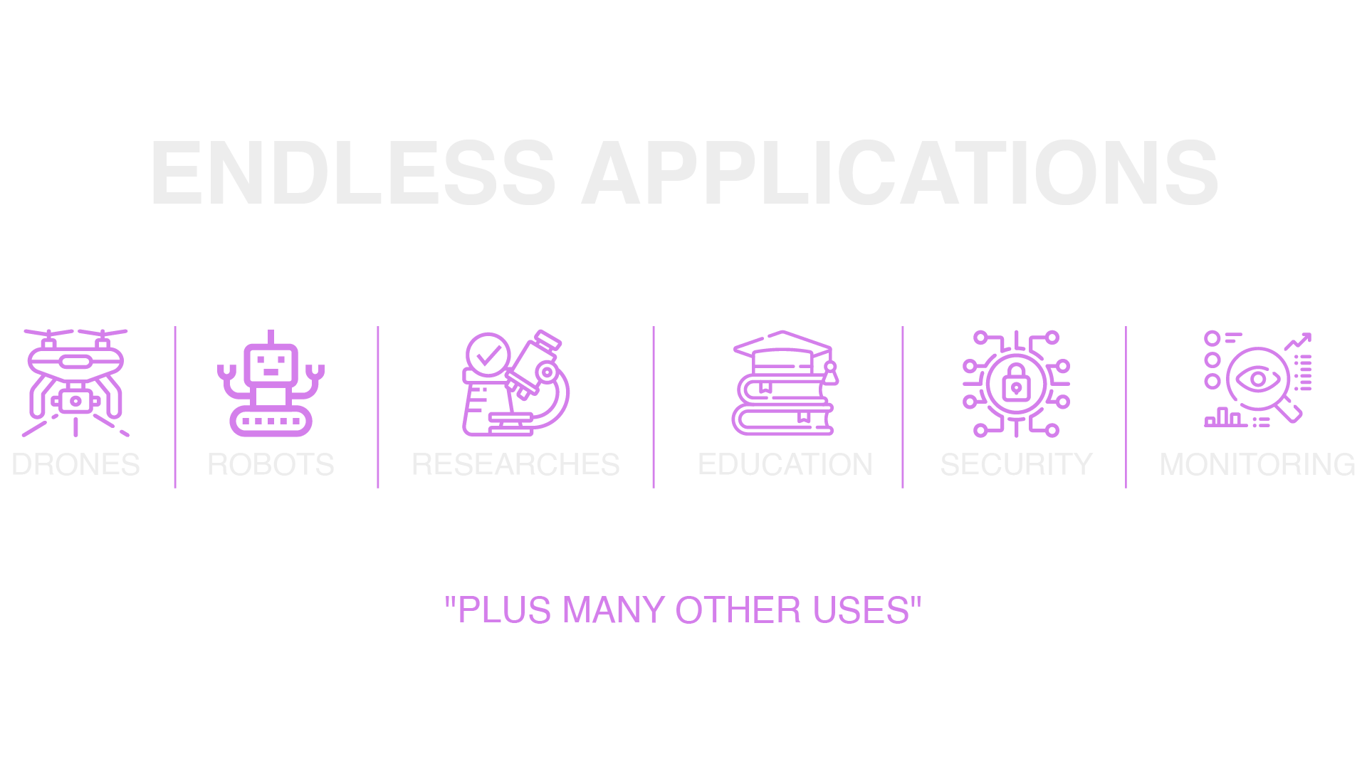
A complete sensor data visualization tutorial only makes sense if you know what you're building toward. Here are the primary application domains for a setup like this:
Drone and UAV Development: Real-time IMU visualization during flight test is essential for tuning flight controllers, diagnosing vibration, and validating sensor calibration. Environmental data adds context for performance analysis — air density affects propeller efficiency, and temperature affects battery performance.
Environmental Monitoring Networks: Researchers and smart city operators deploying sensor networks need dashboards that aggregate data from multiple nodes while showing individual node detail on demand. The RFOXiA data network architecture is purpose-built for this.
Agricultural Technology: Microclimate data at field level — temperature, humidity, pressure, air quality — drives precision agriculture decisions. Visualization dashboards that show spatial and temporal variation help agronomists identify irrigation zones, frost risk areas, and pest pressure conditions.
Industrial IoT and Predictive Maintenance: Combining vibration data (accelerometer/gyroscope) with environmental conditions (temperature, humidity) enables predictive maintenance models. Visualizing these together makes anomalies obvious before they become failures.
Search and Rescue / Disaster Response: Field teams operating in environments without infrastructure need off-grid visualization. The RFOXiA ecosystem — BLE module for long-range communication, sensors module for environmental data, Connect app for local visualization — is designed explicitly for this use case.
Wearable Research Devices: The 24mm × 18mm form factor makes this module viable for wearable applications where motion and environmental data are both relevant — sports science, occupational health monitoring, human factors research.
Getting Started: Your First Visualization Project
The fastest path from zero to a working sensor data visualization tutorial project:
- Order the hardware: RFOXiA Integrated Sensors Module — $39, FCC certified, ships from stock
- Sign up for RFOXiA Club — free, includes $10 welcome credit, Dev Hub documentation, AI Firmware Builder access
- Flash the example firmware from the GitHub repository — outputs structured JSON over UART at configurable rates
- Install Node-RED — fastest path to a working dashboard
- Add the MQTT integration when you're ready to stream to the data network and start earning daily rewards
The AI Firmware Builder inside RFOXiA Club deserves special mention here. If you describe your visualization project in plain language — "I want to log all seven sensors at 10Hz and publish to MQTT with timestamps" — the AI generates production-ready firmware with full source code. This compresses what would be days of firmware work into minutes, letting you focus on the visualization layer where your application actually differentiates itself.
Summary
This sensor data visualization tutorial covered the complete stack: hardware architecture, I2C bus configuration, firmware data formatting, visualization tool selection, dashboard design principles, sensor fusion techniques, and real-world application domains.
The MultiNav Pro+™ Sensors Module is the hardware foundation — seven industrial-grade sensors, single I2C bus, 24mm × 18mm footprint, $39, FCC certified. It handles the sensing layer completely so you can focus on the visualization and application layers that matter for your project.
The best sensor data visualization projects start with hardware that doesn't get in the way. Get the module, flash the firmware, and build something worth visualizing.
→ RFOXiA Integrated Sensors Module — in stock, ships fast.
Written by: Moamen Mohamed LinkedIn